ShopDreamUp AI ArtDreamUp
Deviation Actions


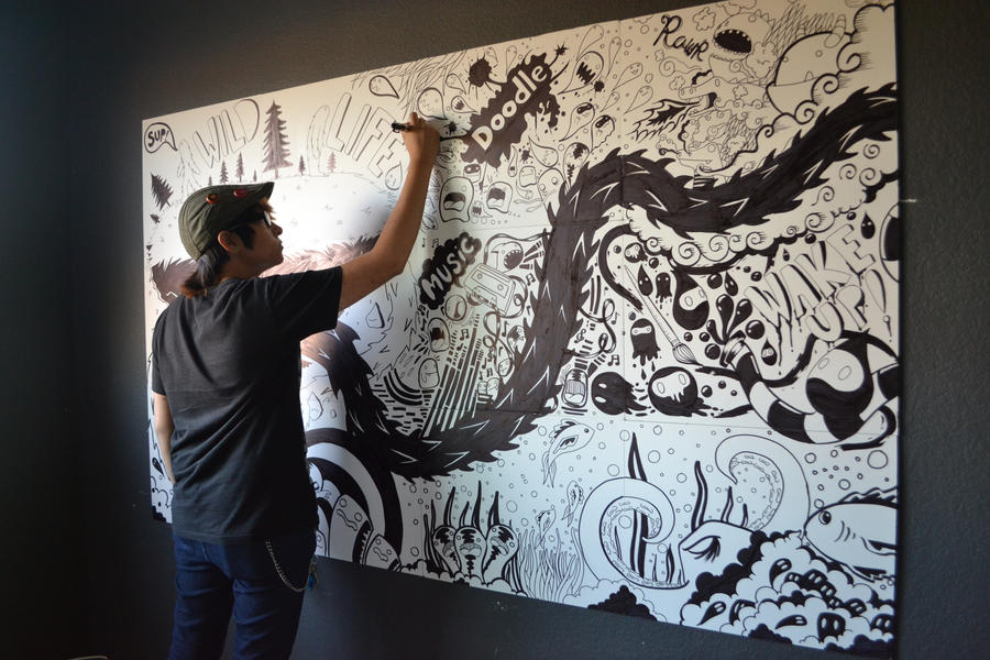
Description
Image size
4608x3072px 3.47 MB
Make
NIKON CORPORATION
Model
NIKON D3100
Shutter Speed
10/250 second
Aperture
F/3.5
Focal Length
18 mm
ISO Speed
800
Date Taken
Jun 12, 2012, 1:39:42 AM
Comments402
Join the community to add your comment. Already a deviant? Log In
First off, I'd like to say great job, this looks fantastic. When you read this review, I'm being as harsh as possible, so just keep in mind the 5 stars across the board and that what I'm saying hurts to type <img src="e.deviantart.net/emoticons/s/s…" width="15" height="15" alt="
And with that...
First, I notice that you have a lot of action going on especially in the top right of the canvas and mostly everywhere else, but on the top left it kind of feels empty. If you had put a little space in-between the clutter and the island, it would have felt like it was supposed to be there, but it kind of feels like the clutter is cramping up next to the island.
Oh and one thing that's more OCD than anything, the grid going through the boards are driving me batty.
Though something that could possibly look cool in the future is playing around with positioning the blocks so it looks like the art is hopping from one block to another, or weaving in-between the spaces.
Secondly, there's a couple spots (like under MUSIC) where some of the straight lines are a little crooked, or the three lines curving towards what looks like a deformed Kirby could have been a little neater. The look of the whole piece is to have a, well for lack of a better term "sloppy" look, but I think the contrast of really nice, smooth and curving thick lines could have looked good with the surroundings. A better description would be "groovy" or "Adventure Time!"...
Thirdly, (if all the boards were sold to 1 person) it almost seems like having some sort of border around the thing like tentacles or waves or what ever your creative mind could come up with would have given it more of a "finished" look, but if the boards were sold to different people then obviously that would look weird to have a partial boarder per block.
Fourth...ly, It would have been really cool if you had colored this, and possibly even have only a single thing colored with a deep red or blue and leave the rest black and white for sort of a MadWorld/Sin City look. But that's just a possible preference.
Finally, I'm done being a nit-picky lame person. This was a fantastic job and you managed to draw everything without messing up (which is kind of bad with ink :/ ). Seeing all this free handed was pretty impressive and the black spiked snake thing through the middle does a good job of separating things and leading the viewers eyes throughout the portrait, and the white snake on the left (behind you) is a added bonus.
If I had enough money, I would have bought this <img src="e.deviantart.net/emoticons/b/b…" width="15" height="15" alt="